
Business owners know that data analysis and visualisation are essential for success. Among the many options available today, Microsoft's Power BI stands out as a powerful tool in the field of business intelligence.
Whether you own a small and medium-sized business or a fast-growing startup, Power BI makes it affordable for owners to transform large amounts of data into compelling visuals that provide clear insights.
In this article, I'll go over five popular charts used in Power BI visuals. I'll also delve into how this functionality can drive decision-making processes with business owner use cases.
1. Gauge Chart
Gauge charts are like the financial equivalent of a thermometer, giving you a visual representation of how your expenses stack up against your budget. As the needle edges closer to the 'red' zone, it's a sign that you're getting close to your budget limit.
But that's not all. These charts offer a ton of benefits, including:
- A quick and easy overview that lets business owners see if their expenses are aligning with their budget
- Color-coded sections (think green, yellow, and red) that make it super simple to assess performance
- A clear visual comparison of actual expenses versus budget, without getting lost in a sea of numbers.
With all these perks, it's clear that gauge charts are a valuable Power BI visual for any business owner looking to keep a close eye on their finances.
An Expense vs Budget example: how gauge charts can help you manage your finances (source: AFON)
Best Use Cases of Power BI Gauge Charts for Business Owners
Managing expenses in relation to a set budget is a crucial aspect of smart financial management for any business.
So let's dive into a fun scenario:
You're the genius behind a bustling cafe right in the heart of the city. Business has been steady, but you're always on the lookout for ways to optimise costs. Every month, you set a budget for various expenses – from raw materials and wages to utilities and marketing.
To keep track of your progress, you rely on a nifty gauge chart that compares actual expenses to the budget.
One month, you spot the needle inching closer to the red danger zone.
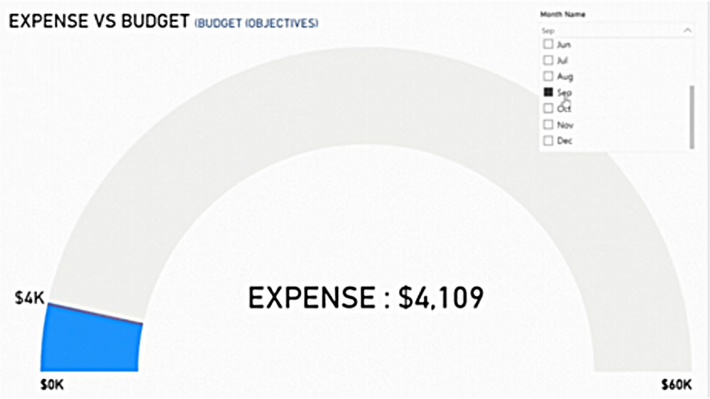
The gauge is just at the red needle danger zone moving closer to $4K (source: AFON)
This visual cue sends you on an immediate investigation. Turns out that utility bills have shot up due to the excessive use of air conditioning during a scorching heatwave.
Realising this, you decide to invest in energy-efficient air conditioning systems and train your staff to use them wisely. This proactive approach not only cuts down utility expenses in the following months but also boosts your cafe's sustainability credentials.
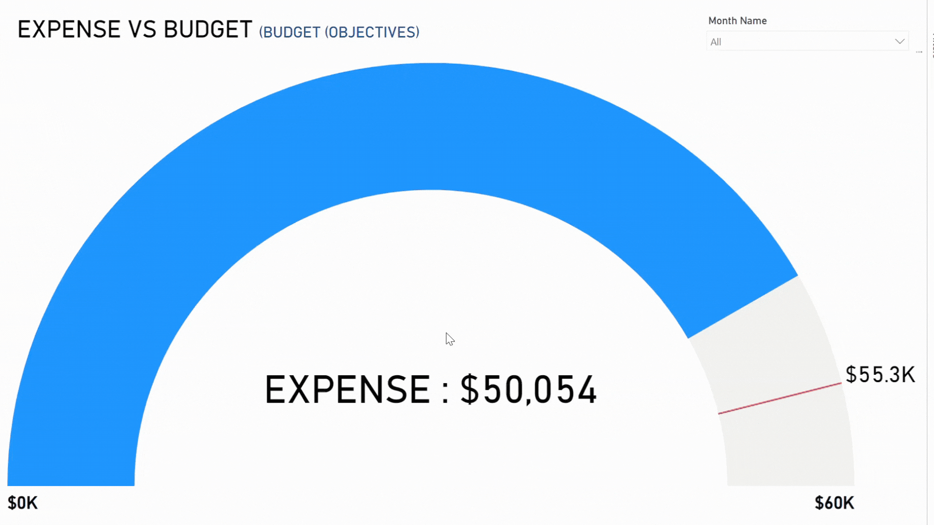
In another scenario, the gauge chart reveals expenses comfortably below the red mark, indicating some savings. While this may seem like a positive outcome, it piques your curiosity and prompts you to dig deeper.
.png?width=1000&height=563&name=Untitled%20(1).png)
When expenses are safely below the red needle mark of $55.3K (source: AFON)
You soon discover that a planned marketing campaign didn't see the light of day, resulting in these savings. Recognising the importance of consistent marketing, you waste no time in launching the campaign right away, ensuring your brand remains visible and your customers engaged.
By keeping a close eye on the gauge chart, constantly comparing expenses to the budget, you're not just crunching numbers; you're gaining valuable insights that fuel proactive measures. This ensures that your business not only sticks to its budget but also runs efficiently and remains adaptable to unexpected challenges.
2. Area Chart
The area chart depicts the relationship between inventory turnover and stockouts.
Inventory turnover shows how often a business sells and replaces inventory, while stockouts represent times when items are unavailable.
This data visualisation offers valuable insights into the correlation between inventory turnover and stockouts, aiding in identifying potential missed sales opportunities. By observing the chart, you can easily assess inventory efficiency and identify periodic stockouts, such as those that occur seasonally.
Furthermore, by comparing these metrics, you can pinpoint any inventory management issues, such as overstocking unpopular items.
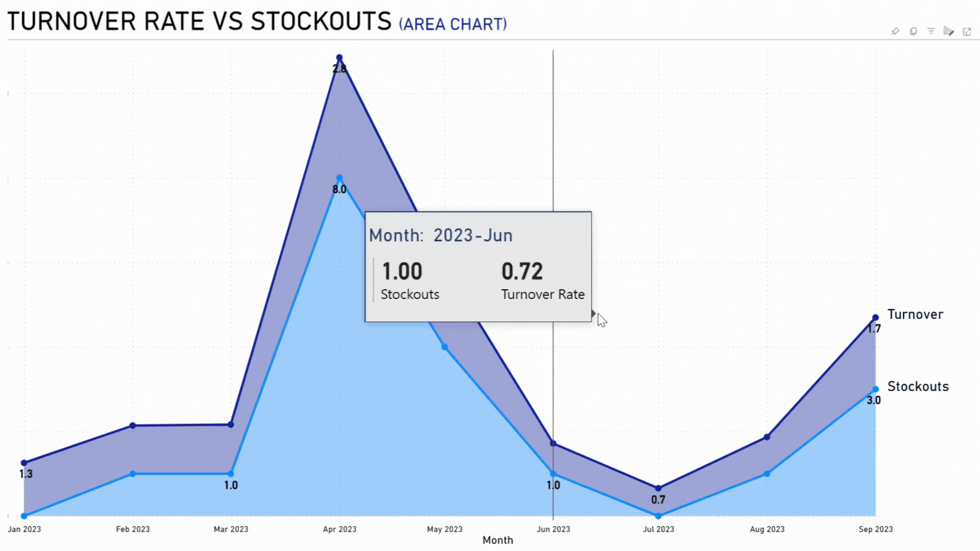
A Turnover Rate vs Stockouts example: how area charts can help analyse inventory (source: AFON)
Best Use Cases of Power BI Area Charts for Business Owners
Imagine you're the boss of a chain of trendy clothing stores. Your main goal is to keep up with the latest fashion trends, making sure your customers have access to all the hottest styles without ending up with a bunch of unsold inventory.
When you take a look at the area chart, you notice something interesting during the summer months. While your swimwear is selling like hotcakes, there are also times when you run out of stock.
After digging a little deeper, you realise that these stockouts tend to happen on those peak shopping weekends. It's clear that your swimwear line is popular, but these stockouts mean you're missing out on potential sales.
So, you decide to shake things up and adjust your inventory strategy. You start ordering a bit more ahead of those busy weekends to make sure you have enough stock to meet the demand.
And guess what? It works like a charm! Not only do the stockouts decrease, but your sales and customer satisfaction go through the roof.
Plus you notice another trend in the data. You have a line of winter jackets that doesn't sell as quickly, but you still experience stockouts.
This could mean one of two things: either the demand for those jackets is lower, or they're not easily accessible in your stores. So, you get to work and make sure those jackets are front and center, easy for your customers to find. And what do you know? The stockouts decrease, and your customers are happier than ever with the availability of those jackets.
By constantly keeping an eye on the area chart that compares inventory turnover to stockouts, you're able to make smart decisions based on data. You optimise your inventory levels, avoid tying up too much money in unsold clothes, and create an amazing shopping experience for your customers.
What's The Difference Between Excel vs. Power BI? See Our Comparison To Find Out
3. Combo Chart
The combo chart showcases the relationship between marketing spend and leads generated over time, providing valuable insights into the efficiency of your marketing efforts.
This Power BI visual allows businesses to directly observe the impact of their marketing expenses. Its dual-axis view of both metrics helps identify patterns or differences between marketing costs and lead acquisition.
Furthermore, a combo chart assists in trend analysis by displaying variations in marketing spend alongside lead counts, giving you a clear picture of the success of your campaigns. And by comparing the bar representing marketing spend with the line graph representing leads generated helps measure the return on investment (ROI) in terms of potential customer interest.
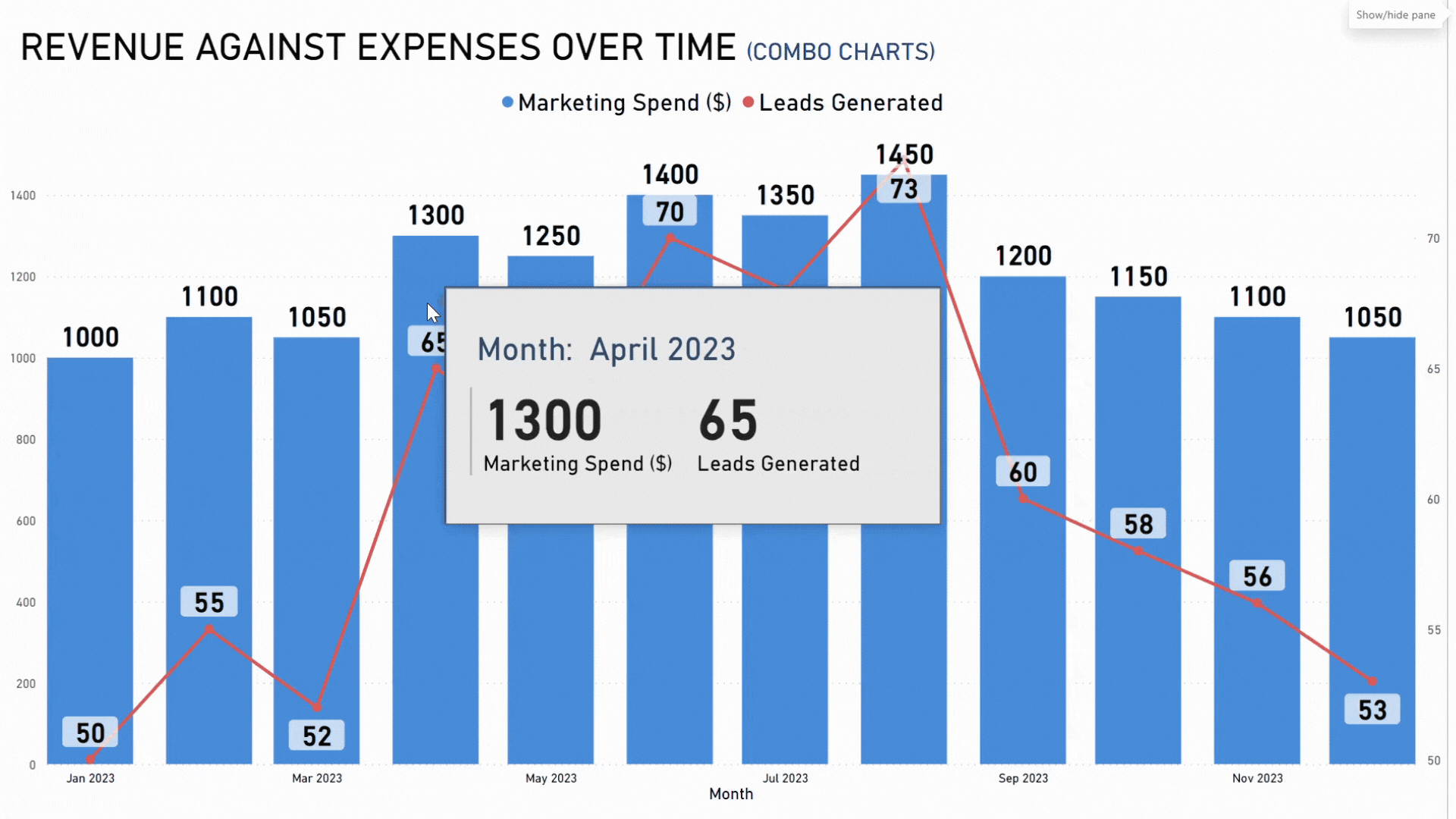
A Revenue against Expenses over time example: how combo charts help track patterns (source: AFON)
Best Use Cases of Power BI Combo Charts for Business Owners
Let's say you're the proud owner of a cutting-edge tech startup that's shaking up the market with its revolutionary product. To make your mark, you're investing big bucks in a range of marketing campaigns throughout the year. And that's where the combo chart comes in handy. It lets you track how each campaign translates into customer interest.
Now, take a look at the chart. Notice that huge spike in marketing spend during April?
%20(1).png?width=1000&height=561&name=Combo_Chart_Ap%20(1)%20(1).png)
Huge spike in marketing spend during April 2023 (source: AFON)
Well, it resulted in a major surge in leads. A lightbulb goes off in your head as you remember that killer targeted ad campaign you launched that month. Clearly, it hit the bullseye and got people buzzing. So, naturally, you decide to use similar strategies in your future campaigns.
But here's the flip side. In September, despite shelling out a pretty penny on marketing, the leads generated are disappointingly low. It's a sign that something's off - maybe your messaging or target audience needs a rethink.
Armed with this valuable insight, you pivot your marketing strategy. You dive deep into market research and customer feedback to tailor your future campaigns and hit the bullseye once again.
By religiously keeping an eye on the combo chart of marketing spend versus leads generated, you're not just throwing money at random marketing efforts. Instead, you're figuring out which strategies give you the best bang for your buck in terms of customer engagement.
Now armed with this knowledge, you fine-tune your marketing playbook, making the most of your resources and ensuring steady business growth.
4. Waterfall Chart
The waterfall chart offers a visual representation of the progress of sales against a predetermined budget, whether on a monthly or quarterly basis. It assists businesses in identifying specific peaks or dips in financial performance.
This chart provides a clear and sequential view of sales over time, with color-coded bars highlighting variances (green for surpluses and red for deficits). Additionally, it aids in analyzing the cumulative impact of sales and determining if they meet or exceed the budget.
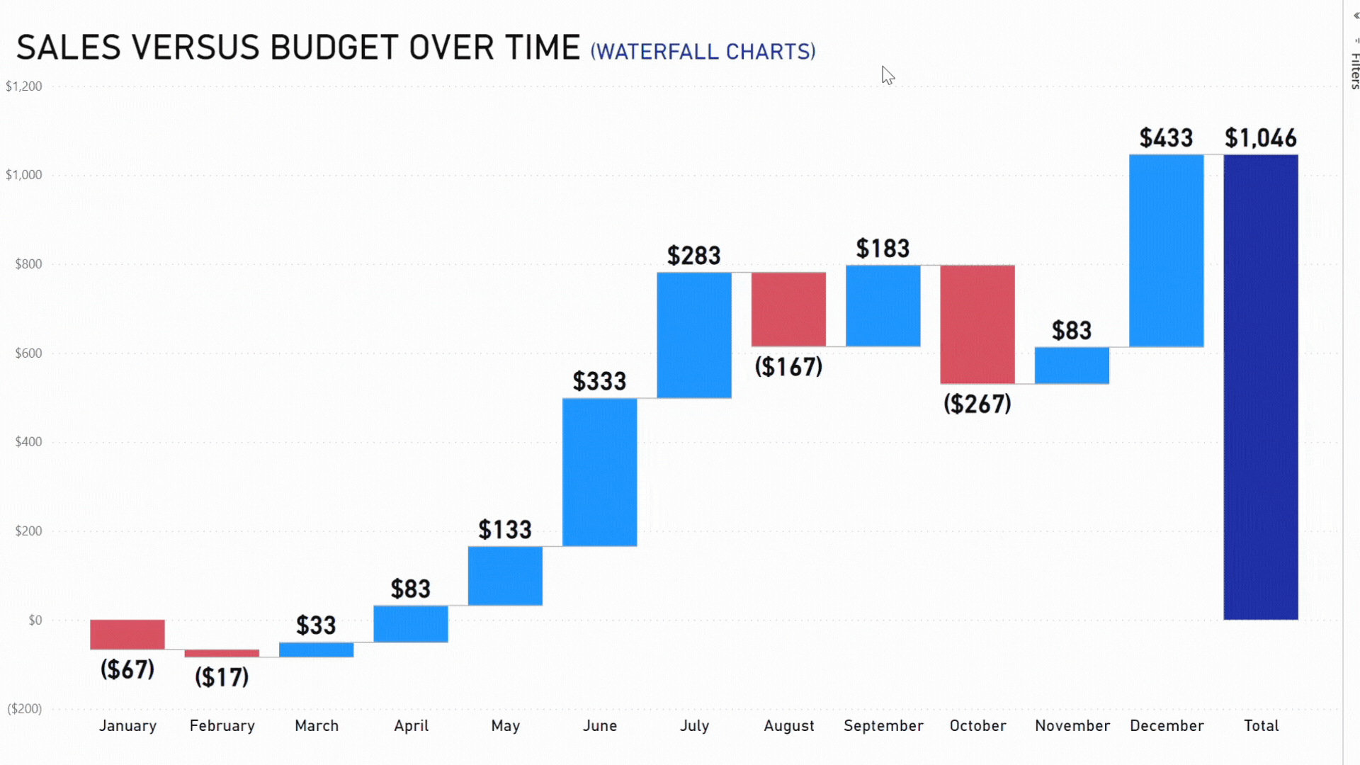
A Sales vs Budget example: how waterfall charts help improve revenue management over time (source: AFON)
Best Use Cases of Power BI Waterfall Charts for Business Owners
Let's pretend you're in charge of a groundbreaking eco-friendly product line. To get a feel for how the market is responding, you establish a solid sales budget for the year, with monthly and quarterly breakdowns.
In this scenario, the waterfall chart becomes your best bet for monitoring sales performance against that budget.
At the beginning of the year, your sales start off a little behind the budget, as indicated by the red bar for Q1.
No worries you think, this is a common occurrence when launching new products.
But as time goes on and people become more aware of your amazing offerings, Q2 shows a green bar, signifying a surge in sales. This could be thanks to a killer marketing campaign or some positive word-of-mouth buzz.
Then comes Q3, and there's a slight dip. It could be due to seasonal fluctuations or even a shortage of stock. This just highlights how crucial it is to align your inventory with demand. But you're not worried because by Q4, your chart shows that strategic discounts and end-of-year promotions give your sales a boost, bringing them close to the targeted budget.
The beauty of the waterfall chart lies in its ability to break down the data even further. By delving into monthly figures, you can pinpoint which specific months are driving the quarterly trends.
Maybe April saw a huge spike in sales thanks to a major influencer endorsement, or perhaps August faced some supply chain hiccups. By being armed with these monthly insights, you can make small adjustments to your strategy and keep pushing forward.
So, by regularly consulting the waterfall chart that compares sales to the budget, you're not just crunching numbers; you're telling the captivating story of your product's journey in the market. This story, backed by solid data and data visualisation, empowers you to make informed decisions and ensures that your product not only meets but surpasses market expectations.
5. Doughnut Chart
The doughnut chart provides a visual representation of how profits are distributed among different item categories, making it easier for businesses to identify their top-performing items.
This Power BI visual is not only visually appealing with its circular, color-coded design, but it also clearly shows the percentage of profits for each category. It offers a concise overview, eliminating the need to analyse tables or lists to understand the profitability of different items.
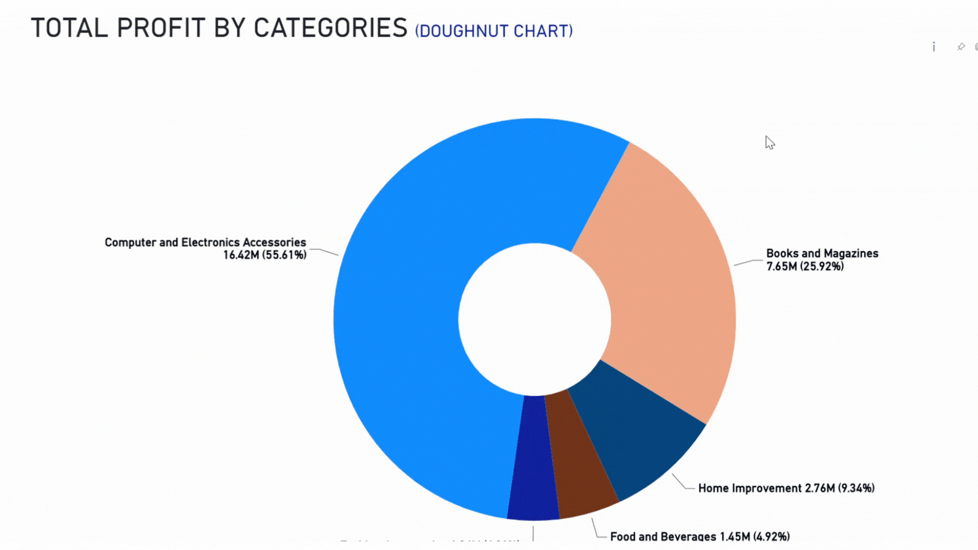
A Total Profit by Categories example: How doughnut charts help assess profit distribution (source: AFON)
Best Use Cases of Power BI Doughtnut Charts for Business Owners
Now let's dive into the world of profit distributions among different item categories. Having a clear understanding of your distributions is crucial for all your inventory management, marketing focus, and strategic planning needs.
Here's a practical scenario for you to envision:
You're the successful owner of a lifestyle store that offers an eclectic range of products, from stunning home decor and trendy kitchenware to fashionable apparel and stylish accessories. To optimise your inventory and make the most of your marketing spend, you decide to analyze the total profit by item categories using a delightful doughnut chart.
As you gaze at the chart, it becomes crystal clear that home decor steals the show with its substantial segment. It's the king of profitability! This could be due to the recent obsession with home improvement or a wildly successful marketing campaign.
Whatever the reason, you decide to seize the moment and take home decor to new heights. You expand the range within this category, give it prime shelf space, and maybe even collaborate with some influential home decor gurus. The possibilities are endless.
But let's not forget about apparel. It may have a smaller slice of the doughnut, but that just means it's time for a little makeover.
You consider revisiting your apparel stock, introducing some trendy designs, and reallocating your marketing resources to give it the attention it deserves. With a little effort, it could become the next big thing in your store.
The doughnut chart is a true beauty in its straightforwardness. Each segment's size and the accompanying data labels give you instant insights. For example, if kitchenware takes up a quarter of the doughnut, you can easily see that it contributes a solid 25% to the total profit. Simple, yet effective.
By consistently analysing the doughnut chart of total profit by item categories, you're making sure that every business decision you make is rooted in cold, hard data. You understand which categories are your cash cows and which ones need a little boost.
Armed with this knowledge, you can tailor your strategies to maximise profit and keep your customers happy and satisfied.
Elevating Business Intelligence Through Power BI Charts
In short, Power BI charts such as the Gauge Chart and Doughnut Chart, offer powerful insights that guide business owners towards effective strategies. With the right set up, you can bring data to life, transforming it into a dynamic narrative that reveals performance, opportunities, challenges, and pathways to success.
If you’re ready to elevate your business insights with this affordable business intelligence tool, click to download our comprehensive Power BI brochure in the link below.
For a more personalised guidance, you can contact our expert analytics consultants here.